'/%3E%3Cdefs%3E%3ClinearGradient id='paint0_linear' x1='0' y1='0' x2='0' y2='2160' gradientUnits='userSpaceOnUse'%3E%3Cstop/%3E%3Cstop offset='.1' stop-color='%23000' stop-opacity='0'/%3E%3Cstop offset='1' stop-opacity='0'/%3E%3C/linearGradient%3E%3C/defs%3E%3C/svg%3E%0A)
Parent-directed layout
The two axes
When working with the parent-directed layout, you need to understand such terms as the main axis and the cross axis. The main axis is defined by the direction property and is the primary axis along which child components are laid out. The cross axis runs perpendicular to the main axis (hence, to the direction).
The direction has four possible values:
- Row
- Column
- Row Reversed
- Column Reversed
You can define the direction in either of the following ways:
- In a parent's properties, under Layout, from the drop-down menu to the right of Children, select a direction.
- In a child's properties, under Layout, from the drop-down menu to the right of Parent, select a direction.
The direction you selected applies to all the child-components whose Layout is set to parent-directed.

If you chose Row or Row Reversed, your main axis runs along the row. The cross axis runs down the columns.
If you chose Column or Column Reversed, your main axis runs from the top of the parent to the bottom. The cross axis runs along the rows.
Change the direction from Row to Column
When you change the direction (the main axis) from Row to Column, the child components' Width value becomes the Height value and vice versa.

Change the order from the outline
By moving the child components in the outline, you can change the visual order of child components while preserving the defined direction.
Set dimensions of a child component
On the parent-directed tab of a child component, you can specify the child component's width, height, max width, min width, max height, min height, and margin. All the dimensions can be defined in px (pixels) and % (percent). You can also use the keyword 'auto' as a dimension value. You can use fr (fractions) for width and height only.
| Property | Description | Possible Values |
|---|---|---|
| Width | Defines width of the component | px, %, fr, auto |
| Min width | Defines the minimum width of the component (overrides the Max width property). It prevents the Width property from becoming smaller than the value specified by Min width. | px, %, auto |
| Max width | Defines the maximum width of the component (overrides the Width property). It prevents the Width property from becoming larger than the value specified by Max width. | px, %, auto |
| Height | Defines height of the component | px, %, fr, auto |
| Min height | Defines the minimum height of the component (overrides the Max height property). It prevents the Height property from becoming smaller than the value specified by Min height. | px, %, auto |
| Max height | Defines the maximum height of the component (overrides the Height property). It prevents the Height property from becoming larger than the value specified by Max height. | px, %, auto |
| Margin | Defines the margin area around the component | px, %, auto |
Using fractions
The fraction unit ('fr') represents a fraction of the leftover space, that is the space to fill minus the sizes of child components defined in pixels. The component whose size is defined in 'fr' adjusts its size according to the leftover space.
To better understand how it works, let's take as an example a box whose width is 200px. The children direction is set to Row. The box has one 1fr-wide parent-directed child component. The child component takes up all the space because the leftover space is equal to the box width, that is 200px.

If you add to the box two 50px wide child components and one 2fr wide child component, the leftover space is equal to 200px - (50px + 50px) = 100px. The leftover space now is shared proportionally between the two child components: the 1fr wide components take 1/3 of the leftover space, and the 2fr wide component takes 2/3 of the leftover space.

Note that fractions can only be used along the main axis, i.e. the direction specified by the parent, fractions used for the cross axis are invalid. For example, if the Row direction is specified for a child component, you can only use fractions for the Width property of the child.
Using the keyword 'auto'
The keyword 'auto' used in a dimension property means that the property is automatically adjusted according to the content. If you remove a dimension's value in the Properties panel, 'auto' is used automatically in place of the removed value.
To place a child component in the center of the parent, set the right, left, top, and bottom margin of the component to 'auto'.
Set wrap for the child components
By default, child components are laid out in a single line, which may result in overflow. The Wrap property allows you to configure the child components to wrap onto multiple lines along the main axis.
To set the Wrap property for child components, go either to the parent's Children block or to a child's Parent block, and then expand the drop-down menu and select an appropriate value from the drop-down menu above Wrap.
Example of top wrap
This example demonstrates parent-directed child components with the Row direction and top-wrap.
The example uses three text components grouped in a box.
The child components are configured as follows:
- The text components' layout is parent-directed.
- The width of the child components is set to 1fr, 2fr, and 1fr.
- The direction (main axis) is set to Row
- The Wrap property is set to Top.
The resulting behavior: As the box's width changes, it tries to preserve the 1:2:1 ratio defined by the child components' fraction values. As the box's width is being reduced, at some point, child components wrap onto multiple lines.
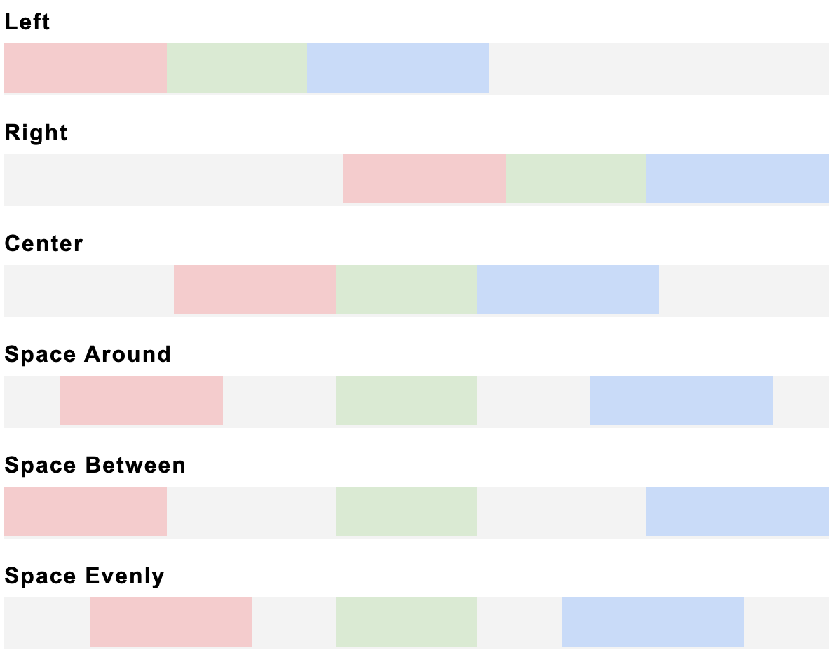
Using Distribute
The Distribute property is used to align the child components on the main axis.
You can set the Distribute property to the following values:
- Left (the default value): Child components are positioned at the left edge of the parent.
- Right: Child components are positioned at the right edge of the parent.
- Center: Child components positioned at the center of the parent.
- Space Between: The first and last child components are flush with the edges of the parent, and all of the space is shared equally between the child components.
- Space Around: The space is distributed around the child components: this adds space before the first child component and after the last child component.
- Space Evenly: Child components have equal space around them.
The below figure helps to understand how the Distribute value affects the child components:
Using Alignment
You can set alignment for all the child components at once or set alignment individually for any child component. The alignment options depend on the direction defined for the child components.
If the direction is Row or Row Reverse you can select either of the following vertical-alignment options:
- Top
- Bottom
- Middle
- Stretch Vertically
If the direction is Column or Column Reverse you can select either of the following horizontal-alignment options:
- Left
- Right
- Center
- Stretch Horizontally
Try different alignment options in the sample design below and see how all the child components align against each other in the parent.
Example of using a combination of parent-directed and self-directed layouts
You can combine parent-directed and self-directed layouts within a single component group. Thus you can combine the advantages of both layouts, which gives you more opportunity to implement the design you want.
For example, you can lay out text components along the main axis using the parent-directed layout, and then add a logo to the parent using a self-directed Icon component. See the video below.