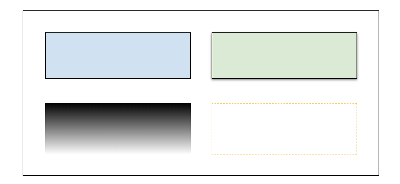
Box
A component that can contain other components and display a set of its own styles.
Summary
The Box component is a basic building block of the MINTDATA™ application UI.
For those who is familiar with HTML, the purpose of Box can remind the one of a container based on <div> tag.

Usage
In most cases the Box is used for logical arrangement of its child items. Common usage patterns:
- Use several boxes with enabled parent-layout, to make your app layout responsive.
- Create a form for collecting user input (for example, 'login' or 'send message' form) - a box with children like Text, Text Input or Button;
- Create a repeatable container for rendering a list of any multi-component items - product cards, chat messages, table records, etc.;
- Use shadows, gradient background or rounded corners on a box to get nice-looking UI;
- ...and more.
Properties
- Box is repeatable;
- Styling properties: Background, Border, Shadows, Padding, Rotation, Layout settings;
- Interaction properties: Normal, Hover and Active behavior, Drag-n-Drop options;
- Component-specific properties:
- Scroll Position: To control scroll position with the Spreadsheet logic.
Events
Try it now
The below button opens a popup with real MINTDATA™ visual designer interface.
Notes
Selecting multiple items on the page and using "Group" operation on them via context menu puts them into a new transparent Box.