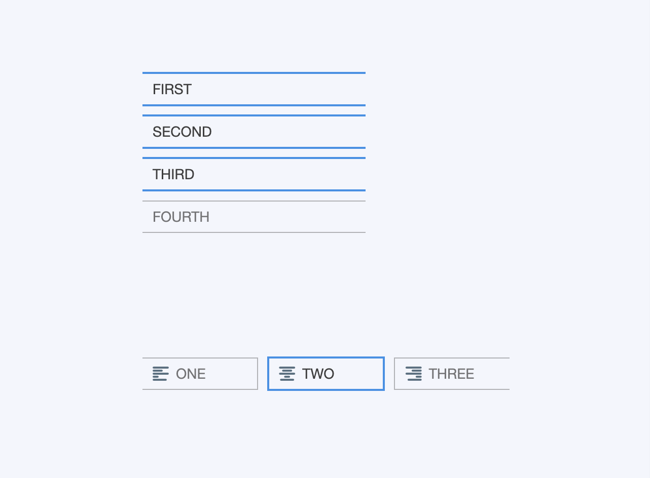
Toggle Button Set
A component that is used to group related options.
Summary
The Toggle Button Set component is used to create a group of related options. The options are available either for multiple selection (several options can be selected at once) or exclusive selection (selecting one option deselects any other).

Usage
- Select a Toggle Button Set component
- Define its layout and style
- If you want to enable exclusive selection, select the Exclusive Selection checkbox
- To track the state of the buttons, bind each button's state to a spreadsheet cell